Published: Oct 29th, 2024
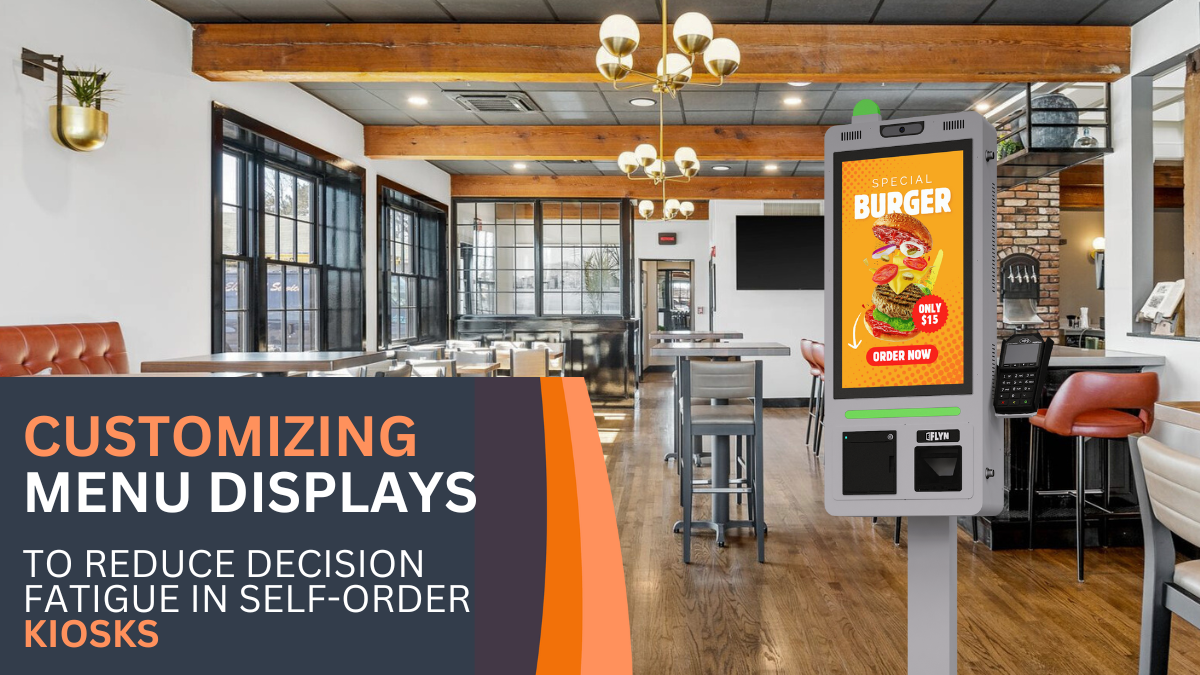
Customizing Menu Displays to Reduce Decision Fatigue in Self-Order Kiosks
Self-order kiosks have transformed how people interact with menus, making ordering faster and easier. However, if customers are presented with too many options or an overwhelming layout, decision fatigue can set in, leading to frustration or even abandoned orders. Decision fatigue occurs when people are faced with a large number of choices, leading to stress and impaired decision-making. In self-order kiosks, minimizing decision fatigue can significantly improve customer satisfaction, reduce order abandonment, and increase overall sales. Here, we’ll explore how thoughtful menu design in self-order kiosks can reduce decision fatigue and create a streamlined, enjoyable experience for customers.

- Grouping and Categorizing Options
Effective menu design begins with organization. Grouping items into clearly labeled categories (e.g., “Burgers,” “Salads,” “Beverages”) helps customers navigate the menu without feeling overwhelmed. This structured approach reduces decision fatigue by enabling customers to quickly locate what they’re interested in without scrolling through a long list of items. By providing a clear hierarchy of options, kiosks can make the ordering process feel simpler and more intuitive.
- Highlighting Popular Choices
Displaying popular or “customer favorite” items at the top of each category can simplify decision-making by providing guidance to customers who may feel uncertain. This technique, known as “choice architecture,” subtly suggests options that are likely to be satisfying, giving hesitant customers a point of reference. Highlighting popular items also reinforces confidence in their selection, as customers may feel assured knowing that others have enjoyed the same choice.
- Limiting Choices per Screen
Decision fatigue is more likely to occur when users are confronted with too many choices at once. To avoid this, self-order kiosks can limit the number of items displayed on each screen, making it easier for customers to focus on a few options at a time. This approach, often called “chunking,” helps customers mentally process choices in manageable portions, minimizing the feeling of being overwhelmed and enhancing overall satisfaction.
- Using High-Quality Images and Visuals
Visuals play a crucial role in reducing decision fatigue. High-quality images give customers a clear idea of each item, making it easier to decide what looks appealing. Research shows that visual elements help reduce mental load and speed up decision-making, as people can quickly assess options based on images rather than reading through lengthy descriptions. Additionally, images can help customers make choices based on what looks appetizing, creating a more satisfying experience.
- Optimizing Navigation and Simplifying Add-Ons
Efficient navigation is key to preventing decision fatigue. Once a customer selects a main item, the kiosk should provide a straightforward process for selecting add-ons or modifications without adding too many steps. For example, offering limited but curated add-on options (like cheese, bacon, or extra sauce) allows customers to customize without feeling bombarded. This curated approach to add-ons helps customers complete their orders faster and with fewer clicks.
- Incorporating Smart Default Options
Smart default options are another way to reduce decision fatigue by providing a pre-set option that can still be customized if desired. For example, a “recommended combo” may automatically include popular side and drink choices. This feature caters to those who may feel overwhelmed by customization but still want a satisfying order. Smart defaults not only save time but also encourage customers to move through the ordering process more smoothly.
- Offering a “Favorites” or “Repeat Order” Option
For repeat customers, offering a “favorites” or “repeat order” option can greatly reduce the time and effort required to place an order. If customers can access their previous selections or pre-set favorites, they are more likely to complete their order quickly and with confidence. This feature is particularly valuable for regular customers, as it minimizes the cognitive load associated with re-evaluating the entire menu on each visit.
- Minimizing Text and Using Clear Language
The amount and complexity of text displayed on a menu can contribute to decision fatigue. Using concise, easy-to-understand language for item names and descriptions helps customers quickly understand each option without the need to read extensive details. Simple, clear language reduces cognitive load, enabling customers to decide faster and with greater confidence.
- Integrating Progressive Disclosure for Detailed Options
Progressive disclosure is a design technique that displays additional information only when it’s needed. In self-order kiosks, this could mean showing basic menu items at first and then revealing further customization options (like toppings, cooking preferences, etc.) only after the customer selects the main item. This approach reduces information overload at the outset, allowing customers to start with a straightforward choice and then explore customization only if they wish.
- Allowing Quick Access to Assistance or “Undo”
Finally, providing customers with an “undo” option or quick access to assistance can help reduce anxiety and decision fatigue. When customers know they can easily backtrack or ask for help, they feel more comfortable exploring options without fear of making a “wrong” choice. This sense of control can significantly enhance the user experience, leading to a more relaxed and positive ordering process.
Conclusion
By employing thoughtful design strategies, self-order kiosks can reduce decision fatigue and provide a streamlined ordering experience. Through techniques like grouping options, highlighting popular choices, limiting displayed items, and offering smart defaults, kiosks help customers navigate menus effortlessly and with confidence. As self-order technology continues to evolve, focusing on user-friendly menu displays will be key to boosting customer satisfaction, reducing abandoned orders, and ultimately increasing sales. For businesses, these design improvements aren’t just about aesthetics; they’re a smart investment in creating a welcoming and efficient experience for every customer.
This content is crafted to be engaging and informative for Eflyn’s audience, with SEO optimization in place. Let me know if you’d like further adjustments or additional details!
